We offer three sets of symbols in the OPUS Projektor:
Material Design Symbols
These symbols can be used for free.
The files were modified from its original state to be used with the blend color feature.
The original files are available here.
The files are distributed with the Apache license 2.0 and the SIL Open Font license.
Remix symbols
These symbols can be used for free.
The files were modified from its original state to be used with the blend color feature.
The original files are available here.
The files are distributed with the Apache license 2.0.
ISO 7000 Symbols
We are offering a collection of over 2400 symbols from the ISO 7000 catalog to be used within projects.
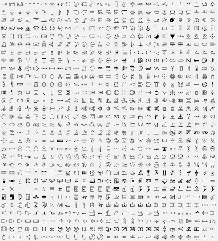
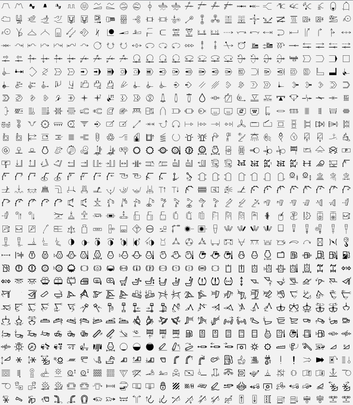
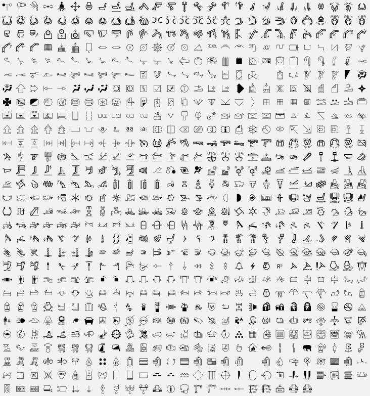
You are not allowed to use these symbols outside of projects for our devices! |
The full symbols package has to be purchased. Please contact your vendor for more information. |
General
You can access the symbols by opening the Symbol Library toolbar on the right side (in the default view).
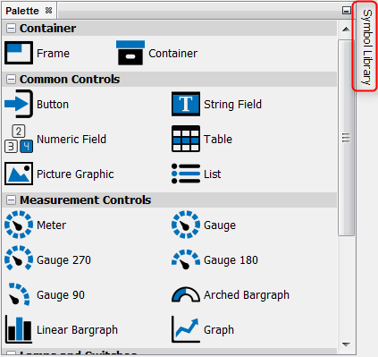
You can also (re-)open the window by clicking the menu Window -> Symbol
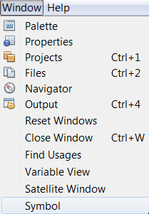
When the library is opened for the first time after the program was started, it takes a while to load the preview images.
You will see a loading pop-up

and you can see the loading progress in the lower right corner of the program.
![]()
Once the previews are loaded, they are instantly available as long as the program stays open. Changing the zoom level requires a reloading of the preview symbols.
UI elements
In the bottom of the symbol library window there are some UI elements

1 - Search bar. Here you can enter search words to filter the symbols. The symbols will be filtered live and all images containing the words will be shown in a new tab called Search. The search will go through all available symbol sets.
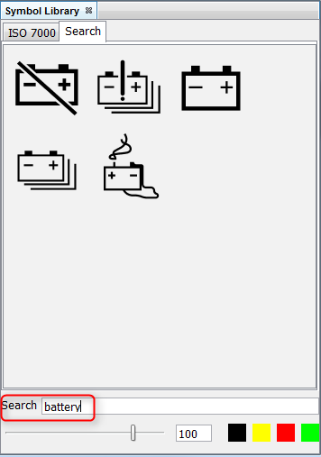
2 - Zoom slider. Here you can change the zoom level of the preview images in the symbol library window. Sliding to the left shows more smaller preview images, sliding to the right shows less larger preview images.
3 - Image size. Here you can set the size of the image in pixels, with which the image will be created. The image will be square, so the size will be X times X. This is only true if the image is not used within another object, e.g. as a background image. Then the size of the parent object determines the size of the image.
4 - Blend colors. Here you can set 4 different blend colors for the creation of the images in your project. The first color is the color of the object in most cases. See here for the use of the other colors.
Using the symbols
You put the symbols into your project with Drag & Drop. This works both on the scene as well as on the project tree.
Depending on where you drop the image, you will get a context menu with different options how to use the image, e.g.
Frame:
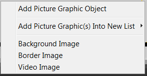
Meters & Gauges:

Buttons:
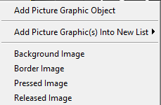
Add Picture Graphic Object - This will create a new Picture Graphic Object with the symbol image as the Image To Display
Background Image - This will use the image as the background image of the object that it was dropped on
Border Image - This will use the image as the border image of the object that it was dropped on
Video Image - This will use the image as the placeholder image for a video frame
Needle Image - This will use the image as the needle image of the object that it was dropped on
Pressed Image - This will use the image as the pressed state image of the button that it was dropped on
Released Image - This will use the image as the released state image of the button that it was dropped on
When dropping a symbol image on a frame or container, the option Add Picture Graphic(s) Into New List is offered.
Opening the sub context menu shows 3 different options:

These options will create a new list object with 2 to 4 instances of the symbol with up to 4 different colors. The colors can be set in the UI interface of the symbol library window by clicking on one of the 4 color fields and choosing a color.
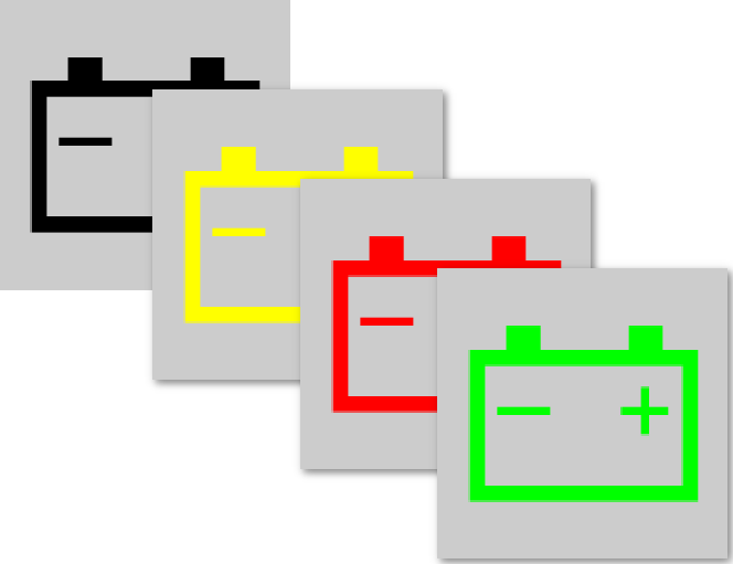
Please note that the blend colors are project-independent and will be saved and kept even after the program was closed.
You can NOT change the color(s) of symbol images at runtime! |
Favourites
Symbol images can be set to favourites to be found easier.
This can be done by right-clicking on a symbol image and choosing Add To Favourites in the context menu:

This will create a new tab Favourites where this and all other images set to favourites are displayed.
Images can also be removed from this tab by right-clicking and choosing Remove from Favourites.
Please note that the favourites are project-independent and will be saved and kept even after the program was closed.