![]() Tutorial video about the meter object
Tutorial video about the meter object
![]() Tutorial video about the hour glass demo project
Tutorial video about the hour glass demo project
The meter can be used to design gauges or other instruments requiring a needle (indicator).
The meter shares many properties with other objects. Find a description of them here.
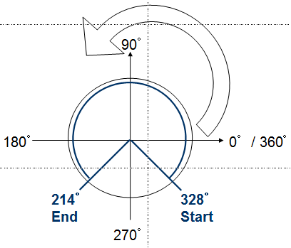
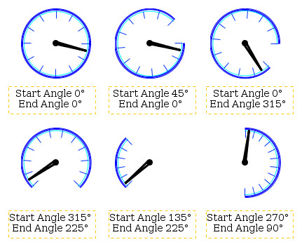
The angles of a meter can be changed with the Start Angle and End Angle properties (see below). The spanning direction for the meter is always counterclockwise:
Screenshot with some meter examples:
|
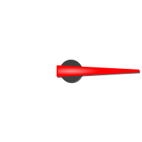
Start AngleThe start angle of the meter can be defined with this property. The start angle's 0° position is at 3 o clock. Default value: 0° Possible values: 0° ... 360° See examples above End AngleThe end angle of the meter can be defined with this property. The start angle's 0° position is at 3 o clock. Default value: 0° Possible values: 0° ... 360° See examples above Deflection DirectionThe deflection direction defines how the value grows in the meter. Either clockwise or anti clockwise. Default value: ClockWise Possible values: ClockWise or AntiClockWise Needle Color (Theme dependent)With this property the color of needle can be defined. Note: This property has no effect if a Needle Image is used. Note: Ses also common properties Color Above Maximum and Color Below Minimum which also have influence on the needle color. Default value: Signal blue (RGB 0, 51, 255) Possible values: Any 24Bit RGB color Needle Image (Theme dependent)Instead of the automatically drawn needle, a needle image can be assigned to the meter to show a more beautiful indicator. The needle image should have the same size as the meter and the needle in the image should always point to 3 o'clock position. Example needle image:
Default value: No image Possible values: Any image with supported format (bmp, jpeg, png, svg) Note: To make the needle image look good when rotated, it is recommended to use scalable vector images (SVG). This prevents steps or anti aliasing artifacts. Draw Arc (Theme dependent)The arc is a small colored line around the meter (see Arc Color below). With this property the drawing of the arc can be enabled or disabled. Default value: Enabled Possible values: Enabled or disabled Arc Color (Theme dependent)The color of the arc of the meter (see above). Default value: Cyan (RGB 0, 255, 255) Possible values: Any 24Bit RGB color Draw Ticks (Theme dependent)Ticks (small lines as value indicators) can be drawn around the meter. With this property the drawing of the ticks can be enabled or disabled. Default value: Enabled Possible values: Enabled or disabled Tick Color (Theme dependent)The color in which the meter's ticks are drawn. Default value: Signal blue (0, 51, 255) Possible icons: Any 24Bit RGB color Number Of Ticks (Theme dependent)The ticks around the meter are evenly spread. The number of ticks can be defined with this property. Default value: 12 Possible value: 0 ... 360 |
The following events can be configured for the meter object: •OnOpenForInput •OnEnabledWithFocus •OnEnabledWithoutFocus •OnValueChange •OnEnterValue •OnEnterNewValue •OnEscape See here for the descriptions of all event and possible actions that can be assigned. |


