 Tutorial video about the virtual keyboard
Virtual keyboards assist the user in entering text or numbers. Two types of virtual keyboards exist:
•Layered Keyboards for text input (portrait or landscape version)
•Numeric Keyboard for number input
To operate a virtual keyboard, the keyboards contain a special version of the button object. See below for special properties of the virtual keyboard buttons.
For virtual keyboard settings in the project properties see here.
To create a virtual keyboard do a right click on Virtual Keyboards in the project tree and select the virtual keyboard type that shall be created.
Virtual keyboard properties are same for layered and numeric keyboards.
Virtual Keyboard Layer Specific properties
Select Layer
Here the layer of the virtual keyboard can be selected. A layer contains a set of keys. On a layered keyboard there are three layers available:
•Layer 1: Lower case characters
•Layer 2: Upper case characters
•Layer 3: Numbers and special characters
A numeric keyboard only has one layer with the numbers.
Default value: Layer 1
Possible values: Any available layer
This property has no effect on runtime, it only shows the different layers in the designer area.
Background Color
The background color of the virtual keyboard.
Default color: black (RGB 0, 0, 0)
Possible values: any 24Bit RGB color
Key Background Image
An image can be selected with this property that is then used as background image for all buttons on the virtual keyboard.
Default value: A default background image
Possible values: Any supported image or no image
Key Background Color
The background color for all buttons in the virtual keyboard can be selected with this property. The background color of the buttons is only visible if a Key Background Image (see above) with transparent areas is used or no background image is set.
Default value: grey (RGB 153, 153, 153)
Possible values: Any 24Bit RGB color
Draw Border
With this property the Draw Border property of all buttons in the virtual keyboard can be enabled or disabled. Enable it if the user shall be able to navigate the buttons via encoder. If only touchscreen input is used, this property can be disabled.
Default value: Enabled
Possible values: Enabled or Disabled
Font Attribute
The font attribute for all buttons in the virtual keyboard can be selected with this property.
Default value: Default_DejaVu Serif
Possible values: Any font attribute defined in project properties
Font
The font that is used for all buttons in the virtual keyboard can be selected with this property.
Default value: DejaVu Serif
Possible values: Any available font
VKBButton Specific properties
Virtual keyboard buttons are basically normal button objects that have some additional properties.
The virtual keyboard buttons are language dependent by default.
Button Type
A virtual keyboard button can have one of the following types:
•Character
Button for normal character input. When a Character button is pressed, the button's value is added to the edited value.
•Layer Switch
When pressing this button, the layer of the keyboard will be switched. The target layer can be selected with the Switch To Layer property (see below).
•OK
The OK button confirms the edited value and closes the virtual keyboard
•Cancel
The cancel button closes the virtual keyboard without confirming the new value (it will be reverted to the value before opening the virtual keyboard)
•Delete
The delete key deletes the last character or number that was entered
•Toggle Sign
The Toggle Sign button should only be used on numeric keyboards. It can be used to toggle the edited value from positive to negative and vise versa.
Display Text
This language dependent property defines the character displayed on the button. It can be different for each language.
Character Values
This language dependent property defines the value that is added to the edited value when the button is pressed. It can be different for each language.
Switch To Layer
This property is only available if Button Type (see above) was set to Layer Switch.
Possible values: Any available layer of the virtual keyboard.
VKB in UT Plugin projects
In UT Plugin projects a different kind of keyboard will be used automatically. This keyboard cannot be modified.
The numeric keyboard looks like this:
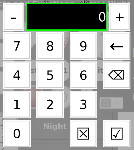
It shows the current value and the allowed value range.
The string keyboard looks like this:
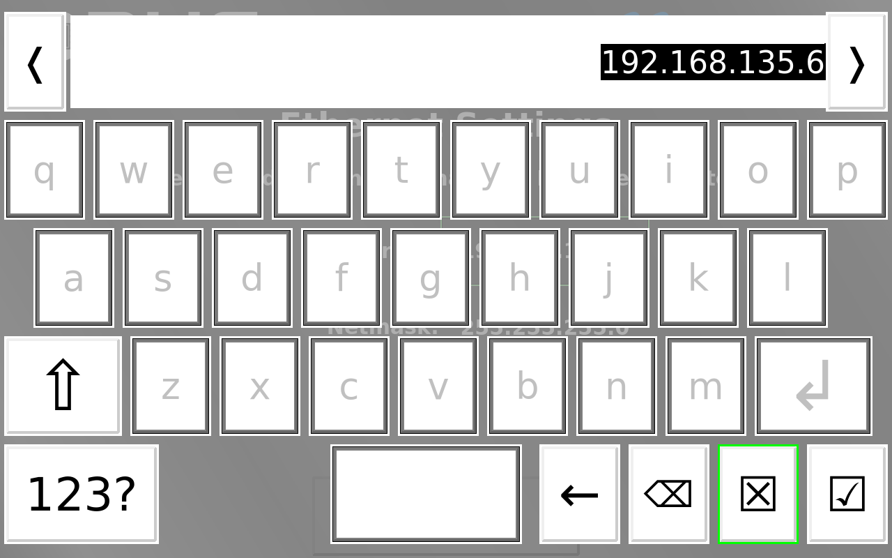
If only a sub-set of the possible characters should be allowed, an input attribute needs to be created and applied to the according input objects.
The button 123? in the lower left switches to numbers. Next to it, if no input attribute is set, a +++ button is displayed. That switches to special characters.
The button with the arrow left deletes one character of the current content. The button with the wide arrow left with an X deletes everything. The squared X button cancels the input, the one with the checkbox confirms it.
In the top the current string is displayed. Left and right are cursor keys that will move the cursor to a position in the string.