 Tutorial video about the list object
The list object is a useful object to show other objects based on a value (e.g. two icons in a list showing a different state).
A list always contains other objects. It is possible to either display only one object at a time or multiple objects, this can even be defined for the different navigation states of the list (see properties Items Visible (Normal Mode) and Items Visible (Editing Mode)). This makes it possible to show something like a drop down menu (1 item visible in normal mode, more visible in editing mode).
Note: At runtime the list object's height is automatically calculated based on the number of currently displayed child items (and their item height). This also means that a list that has no child items will NOT be displayed at all. In the designer the list is always shown in full height based on the properties Items Visible (Normal Mode) or Items Visible (Editing Mode) even if no or less children are present.
As with all other objects there are some common object properties that are also used by the list object. Se here for a description of the common properties.
The list specific properties are listed below.
List Specific Properties
Item Height
The height of a list object can not be changed via the common Height property. The height of the list is defined by a combination of the Item Height property, the Border Width (and Draw Border) and the number of visible items items in the list (see Items Visible (Normal Mode) and Items Visible (Editing Mode) below).
Use this property to define the height of each item (other object) in the list.
Default value: 30 pixel
Possible values: 1 ... 1280 pixel
List Item Mode
This property is only a preview for the two list modes that are available (normal or editing). It has no effect on runtime behavior.
Note: This property can only be changed if the property Open For Input is enabled.
Default value: Normal
Possible values: Normal or Editing
Items Visible (Normal Mode)
With this property it can be defined how many items (or objects) are visible in normal mode of the list (when it is currently not edited (not open for input)).
Default value: 1
Possible values: 1 ... 255
Items Visible (Editing Mode)
When a list is edited (made open for input by the user) it is possible to show more items than in normal mode. Like this it is possible to create a drop down box that shows the user more options.
Note: This property can only be changed if the property Open For Input is enabled.
Default value: 1
Possible values: 1 ... 255
List Items
When editing this property a dialog will pop up that provides some ways to change the items in a list

-Add a single object
(1) In the upper part of the dialog, the items of List is shown.
(2) In the lower part of the dialog, objects can be added to the selected list. To change which type of object shall be added, the drop down box Select the Object Type to add can be used.
(3) When the settings are made, the Add button can be pressed to add the object to the list.
(4) With the button Add multiple Images many images can be loaded into the list object at once. New Picture Graphic objects will automatically be created, one for each image.
-Delete a single object
Just select one object in the table and hit the Delete button on the right side of the dialog.
-Add multiple images
It is possible to add multiple images to the list in one step.
Click the Add multiple Images button on the right. A file dialog will appear. In this file dialog open as many images (from the same directory) as wanted.
For each selected image a new picture graphic object will automatically created (with default settings) and added to the list.
-Change the order of the items
The table in the dialog shows all items in the list. The one of the top is the one that will be shown when setting value 0 the list. The one on the bottom of the list is the one that is shown when the highest value is set.
To change the order simply select one item in the table and then click either the Up or Down button on the right side of the dialog.
-Number Of List Items
This property can not be edited. It just shows the number of items inside the list.
-Touch Input (new in 2020.4.2)
This property is not visible in the OPUS Projektor property window. It can be set with JavaScript.
The syntax is as follows:
setProperty(<list_id>,"Touch Input",true);
As a result, a list object in editing mode will now look like this:
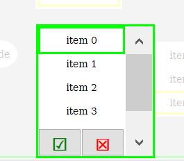
There are two buttons, one Enter, one Escape, and the background of the page will be half-transparent to put visual focus on the edited list.
The default value for this is false, so it needs to be activated e.g. on the event OnPageInit of the page where the list object is.
Behavior details
Some details as to how the list objects behaves in certain special situations:
If only one item is shown the list object shows
•the item belonging to the value if the item is valid (not a NULL-ID and not rendered invisible via visibility)
•nothing if value is below max value and the item is invalid
•the last item if the value is equal to or above max value (and it is visible)
If more than one item is shown the list widget
•shows as many items as configured if there are enough valid ones
•shows all valid items if there are less than items configured for the list (note that this will result in reduced height of the widget)
•current value/selected item is identified by a focus frame using the 'ENABLED_WITH_FOCUS' state of the item
•if the item does not have such property (e.g. because it's a container) the respective setting of the list is used
•if an invalid item is selected, no focus frame is shown
•the last item is shown if the value is equal to or above max value (and it is visible)
•add an invalid item at the end of the list if nothing should be shown for values above the list's range
•If there is only one valid item in a multi-item list, the list is expanded to two items so that the valid one is always visible
•This shows the 'null item' at the end of the list but avoids showing nothing where as single item list would do that
•While editing only valid items can be selected and the value will be set accordingly
FAQ
How to add an object to a list
There are different ways to add an object to a list:
1.Drag a new object from palette to the list on the designer area
2.Drag an existing object from the project tree to the list in the project tree
3.Edit the property List Items (see description below).
4.Copy an existing object and paste it into the list (the size of the pasted object is automatically adjusted so take care when using paste as reference since the original object will also be modified)
How can I show / hide / customize a scroll bar for all list objects when the list is open for input?
Go to the project properties of the project and the to the Object section.
On the bottom of the dialog there is an option Size of List object scrollbar.
Set this to 0 to disable all scroll bars.
Set this to the width the scroll bars shall have to customize it (if touchscreen editing is preferred, this should be set to at least 50 pixel so that the user is able to touch the scroll bar).
Note that the scroll bar is only shown at runtime.
Events
The following events can be configured for the list object:
•OnOpenForInput
•OnEnabledWithFocus
•OnEnabledWithoutFocus
•OnValueChange
•OnGetValue
•OnEnterValue
•OnEnterNewValue
•OnEscape
See here for the descriptions of all event and possible actions that can be assigned.